
Website operator fined for using Google Fonts “the cloudy way” – Naked Security
Typefaces can be a tricky business, both technically and legally.
Before word processors, laser printers and digital publishing, printed materials were quite literally “set in metal” (or wood), with typesetters laying out lines and pages by hand, using mirror-image letters cast on metal stalks (or carved into wooden blocks) that could be arranged to create a back-to front image of the final page.
The laid-out page was effectively a giant stamp; when inked up and pressed against a paper sheet, a right-way-round image of the printing surface would be transferred to the page.
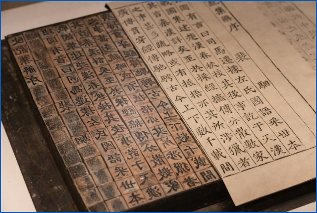
.Note how the printed page is the mirror of the typesetter’s blocks.
For books printed in Roman script, typesetters kept multiple copies of each letter in separate pigeonholes in a handy tray, or printer’s case, making them easy to find at speed. The capital letters were kept in their own case, which was placed by convention above the case containg the small letters, presumably so that the more commonly-used small letters were closer to hand. Thus capital letters came from the upper case, and small letters from the lower case, with the result that the terms upper case and lower case became metaphorical phrases used to refer to the letters themselves – names that have outlived both printers’ cases and movable type.
Getting the right look
Designing a typeface (or “font”, as we somewhat inexactly refer to it today) that is both visually appealing and easy to read, and that retains a unique and attractive look across a range of different sizes, weights and styles, is an astonishingly complex task.
Indeed, although the digital age has made it easy to create new fonts from scratch, and cheap to ship them as computer files (another physical document metaphor that has survived into the computer era), designing a good typeface is harder than ever.
Users expect the font to look good not only when scaled up or down to any size, including fractions of a millimetre, but also when displayed or printed as a collection of separate pixels at a variety of resolutions using a range of different technologies.
As a result, good typefaces can be expensive,…
 MOSCOW: Russia’s biggest mobile operator MTS on Thursday reported a 46.5% net profit jump to 17.2 billion roubles ($232.06 million) in the second quarter and raised its full-year revenue guidance to high single-digit growth.